This map was compiled by the General Assembly’s Legislative Rearch Unit as part of a 2015 report. Researchers cautioned their picture of the comparison of how much counties pay into state government and how much they get back is “not perfect,” representing more of a “rough outline of a part of state collections and disbursements.”
Residents in counties shown in red received 80 cents or less back for every dollar in taxes they paid into the state general fund.
In counties shown in black, residents received 81 cents to a dollar back for every dollar they paid in taxes. Those in blue received between $1.01 and $2 back for every dollar they paid. Those in green got back more than $2 for every dollar in taxes.
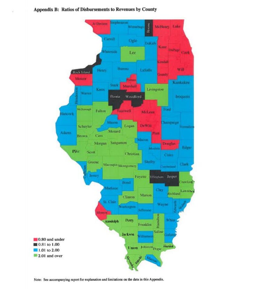
Among the caveats: It’s based on 2013 data, the most recent at the time. The map reflects the collection and disbursements of money from the state’s General Fund only, because that could be broken down by county . It does not include other revenues that cross county lines, such as the motor fuel tax, driver’s license fees, riverboat gaming revenue. Similarly, it does not represent all spending, excluding such expenditures as capital projects, transportation and some Medicaid spending.
Researchers also noted that allocation of resources is not precise because “counties are somewhat arbitrary geographic divisions rather than functional economic or social units.”
RELATED: Rauner, Dems map different routes on school funding mess Rauner decries Senate school funding override, vows compromise
State Revenue by Scott Fornek on Scribd